 For Everyone
Local Deals Website Guide: Map‑First Discovery in 2026
by AIR.POG Team
You're driving through a part of town you don't know well. A hand-painted sign outside a café says lunch special, and for a second you think, if that deal is real, why isn't it already on my phone with directions and hours attached?
That small moment is the whole category. A local deals website today isn't just a page of printable coupons. It's a live, location-aware way to find nearby offers from real businesses, check whether they're still active, and get there fast.
That shift matters because people don't shop for nearby deals the way they used to. Local search on mobile is already action-heavy. 50% of smartphone users who conducted a local search visited a store within a day, and 18% of smartphone local searches led to a purchase within a day versus 7% for non-local searches, according to Google's local mobile search study. If someone is already near a store, “show me what's close right now” works better than “send me a giant coupon email for later.”
Table of Contents
- What a Local Deals Website Actually Does Today
- The Core Idea Behind Map-First Live Discovery
- How Map-First Platforms Differ From Traditional Coupon Sites
- Why Progressive Web Apps Fit Local Deals So Well
- Key Features That Make a Map-First Deals Website Useful
- Who Actually Uses a Local Deals Website Day to Day
- Picking a Local Deals Website That Saves Time and Money
<a id="what-a-local-deals-website-actually-does-today"></a>
What a Local Deals Website Actually Does Today
A modern local deals website sits between search, maps, and merchant listings. Its job is simple: surface nearby offers that a person can realistically use within the next few minutes or hours.
That sounds obvious, but it clears up a common confusion. Many people still picture the old model: browse categories, click a coupon, maybe print something, and then figure out whether the place is even nearby. Today's better platforms flip that around. They start with place, not category.
<a id="from-coupon-page-to-live-neighborhood-view"></a>
From coupon page to live neighborhood view
If you spot that café sign while driving, a useful local deals website should answer four questions immediately:
- What's near me: not citywide, but right around your current block or route
- Is it open: because a deal at a closed shop is dead weight
- Is it current: not an expired promo that never got cleaned up
- How do I get there: one tap, not six
That's why the category has moved beyond coupon libraries. Good platforms now combine a verified business index, a map interface, quick merchant media such as short reels, and a tap-to-route path into Google Maps or Apple Maps.
Practical rule: If a deal takes longer to verify than to redeem, the product is solving the wrong problem.
<a id="why-the-category-looks-different-now"></a>
Why the category looks different now
The older daily-deal era trained people to think about massive email blasts and broad discounts. That model got huge, fast. Groupon officially launched in November 2008 and expanded from 30 markets in 2009 to almost 500 new markets in 2010, while its subscriber base grew 2,500% from 2 million to over 50 million in that year, according to the deal-of-the-day historical overview. But that wave also taught the market something important: volume alone doesn't create a smooth local discovery experience.
What people often want now is smaller and more immediate. Not “show me every deal in the city.” More like, “show me the three worthwhile offers within a quick detour.”
That's why two product shifts define the category today. First, platforms are moving from static coupon lists to map-first discovery. Second, they're moving from heavyweight native installs to progressive web apps that open fast and behave more like a utility than a shopping destination.
<a id="the-core-idea-behind-map-first-live-discovery"></a>
The Core Idea Behind Map-First Live Discovery
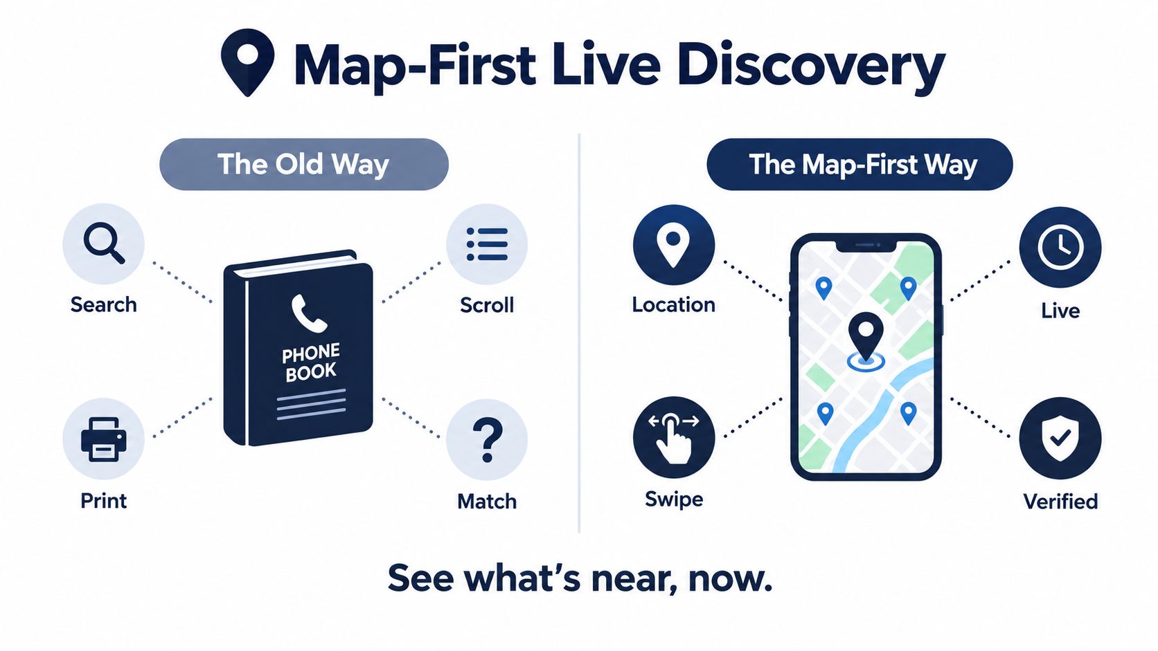
A traditional coupon site works a lot like a phone book. You search by category, scroll through entries, maybe save or print something, and only then figure out whether any of it fits where you are.
A map-first platform reverses that logic. The map is the homepage. Your location becomes the organizing principle, and offers show up around your current dot instead of hiding inside categories.
<a id="how-the-mechanic-works"></a>
How the mechanic works
Under the hood, the idea is plain even if the interface feels fancy.
Every merchant claims a place on the map. Every offer gets attached to that place. The platform then draws those offers as pins or clusters while you pan, zoom, or change radius. If several businesses sit close together, pins can bunch into a cluster until you zoom in. If you move across town, the visible offers change with the map.
A good explainer of this pattern is the broader idea of a deal map interface for nearby offers. The point isn't the phrase itself. The point is the interaction model: move the map, change the options.
<a id="why-proximity-changes-the-whole-session"></a>
Why proximity changes the whole session
This isn't just a design preference. Search behavior changes when nearby options change. A 2023 empirical study of offline shopping found that present-store distance and present-store density substantially affect mobile search behavior, with closer stores increasing detailed search depth and higher density increasing both depth and breadth of product searches, as summarized in this ScienceDirect study on real-time location and local search behavior.
In product terms, that means geospatial relevance isn't decoration. It's the ranking engine.
A practical map-first session usually depends on three signals working together:
-
Proximity
The site should care how close the business is to the person right now. -
Freshness
The offer should reflect a usable time window, not a stale listing that lingers for weeks. -
Verification
The business and deal should be confirmed enough that the user doesn't feel tricked when they arrive.
Nearby, current, and credible is a better definition of a live deal than “big discount.”
<a id="how-tap-to-route-closes-the-loop"></a>
How tap-to-route closes the loop
The final step is what makes map-first discovery feel complete. When someone taps a pin, the system shouldn't just open a long merchant profile. It should let them route there immediately.
That matters because the discovery moment is brief. Someone walking between errands, parking near downtown, or looking for a fast lunch break often wants to decide in seconds. In that moment, the shortest path wins.
<a id="how-map-first-platforms-differ-from-traditional-coupon-sites"></a>
How Map-First Platforms Differ From Traditional Coupon Sites
The easiest way to understand the category is to compare behaviors, not branding. Most “Groupon versus everyone else” conversations miss the divide. The deeper split is between planned coupon hunting and in-the-moment local discovery.
<a id="the-planner-and-the-walker"></a>
The planner and the walker
Traditional coupon sites serve the planner well. Someone sits down on Sunday night, searches for a spa deal or dinner promotion, and browses by category. That's a calm, intention-heavy session.
Map-first platforms fit the walker, driver, tourist, or commuter. The person isn't building a perfect future plan. They're solving a location problem in real time.
| Dimension | Traditional Coupon Site | Map-First Live Discovery | |---|---|---| | Intent | Works best for planned browsing and category-led searches | Works best for immediate “what's near me now” decisions | | Freshness | Often relies on longer-running listings and evergreen pages | Treats deal timing as live inventory that can rotate or expire | | Interface | List or grid views sorted by category or merchant | Geospatial canvas with pins, clusters, and radius-based context | | Trust | Can mix direct offers with uneven third-party aggregation | Usually leans on verified business listings tied to a real place |
<a id="four-differences-that-shape-the-experience"></a>
Four differences that shape the experience
Intent fits different moods
The classic coupon user behaves like a planner. They'll tolerate more clicks because the search is part of the task. The map-first user behaves like someone already in motion.
That difference sounds minor until you build for it. A person in motion won't read five tabs of fine print. They want quick confidence.
Freshness is operational, not cosmetic
A lot of old coupon pages feel current because they're still online. That doesn't make them current. Local deals are only useful when timing matches reality.
Historical coverage of the daily-deal boom shows why this matters. Groupon's early rise was explosive, but industry commentary also notes that daily deal sites began to slide in 2011 and 2012 after rapid growth in 2010, as discussed in the Groupon case overview from the University of Richmond. One reason the category had to evolve is that broad, email-driven blasts weren't enough to support immediate local intent.
Interface changes what the user notices
A list makes every offer look equally abstract. A map reveals context instantly. One café is around the corner. Another requires crossing town. A third is near the grocery stop you were already making.
That's why map-first products often feel faster even when the same underlying businesses are present. The spatial layer cuts out mental sorting.
Trust is a product feature
The skeptic has a simple internal monologue: Is this deal real, and will the business honor it?
Recent consumer behavior makes that concern hard to ignore. In 2026, 91% of consumers said they do not trust deals without first verifying them, while 85% consider contact information and opening hours important, and 67% often or always look at reviews after a local search, according to the consumer deal and local verification summary cited here.
So the trust layer isn't extra. It's the product.
<a id="why-progressive-web-apps-fit-local-deals-so-well"></a>
Why Progressive Web Apps Fit Local Deals So Well
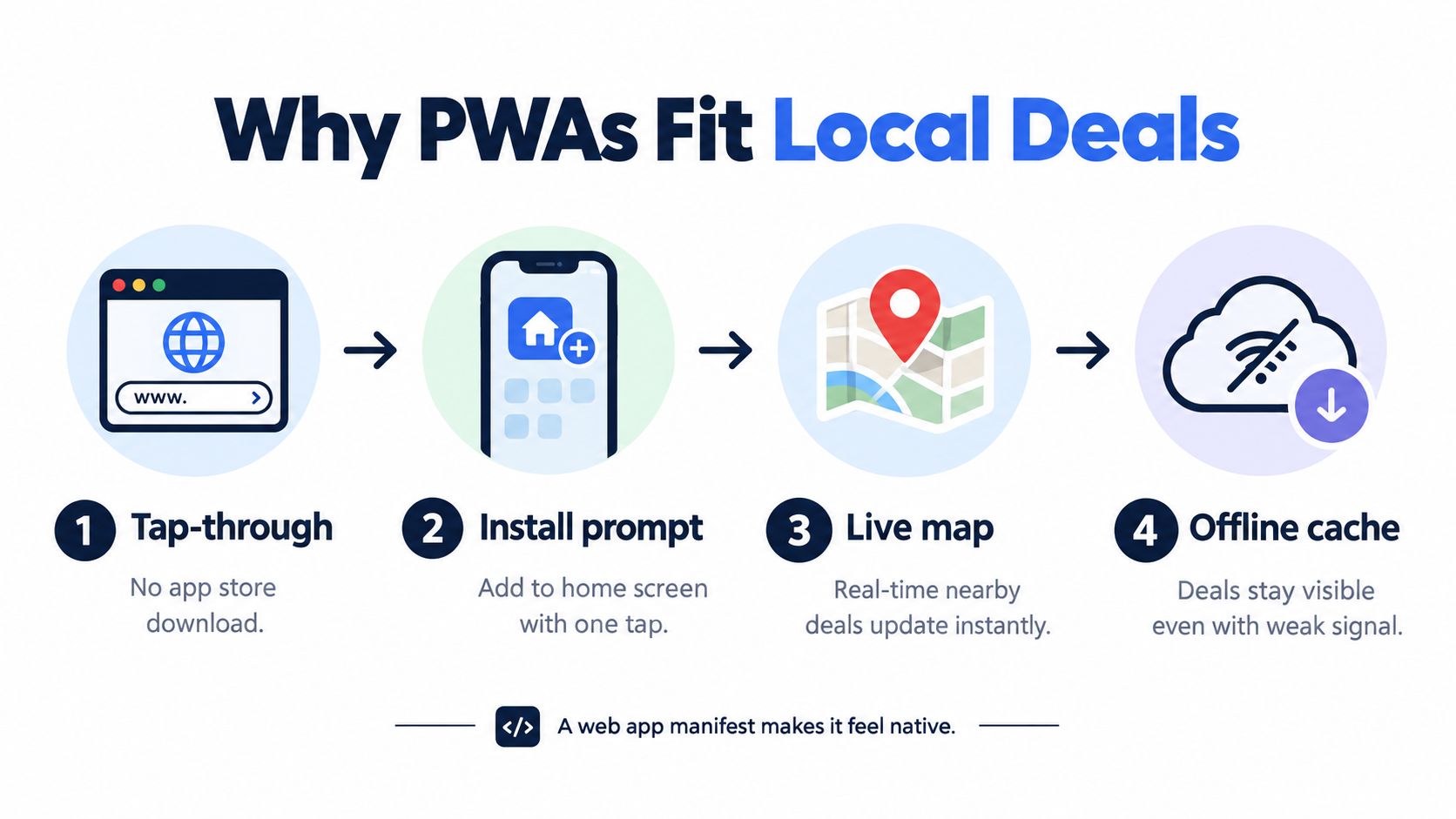
A map-first local deals website needs to feel fast, simple, and app-like. That's why progressive web apps, or PWAs, fit this category so well.
A PWA gives you much of the feel of a native app without forcing people through an app store install before they can even look around. For local deal discovery, that matters because many sessions start casually. Someone taps a link, opens a site, checks the map, and decides whether it's worth keeping.
<a id="what-makes-a-website-feel-installed"></a>
What makes a website feel installed
A lot of people hear “web app manifest” and assume it's technical trivia. It's simple. The manifest tells the browser key things about the app, including its name, icons, and how it should open.
MDN lists the main display options as fullscreen, standalone, minimal-ui, and browser, with browser as the default if display is omitted, in its PWA manifest display reference. For a local deals product, standalone or fullscreen helps because it reduces browser chrome and gives the map more room.
If you want a plain-language comparison, this breakdown of PWA versus native app tradeoffs captures why the install model matters so much for quick-use products.
<a id="why-this-matches-real-local-behavior"></a>
Why this matches real local behavior
People don't always decide in advance that they want a local deal app. Often they discover the need in the moment. A PWA supports that behavior better than a forced download path.
A useful local deals PWA should make a few things easy:
- Open fast from a link: no store detour before first use
- Add to home screen: so the second visit feels like an app launch
- Reopen cleanly: especially when signal is weak or the user is moving
- Use full screen well: because map visibility matters more than decorative UI
A local discovery tool should behave like a shortcut, not a commitment.
<a id="why-native-style-friction-can-hurt-this-category"></a>
Why native-style friction can hurt this category
Native apps still make sense in some product categories, especially when someone already has deep loyalty to a brand. But local deals discovery often starts broader and lighter. Users are testing a place, a route, a neighborhood, or a spare ten minutes.
That's why PWAs fit so naturally. They support instant launch, can feel installed after add-to-home-screen, and keep the interaction focused on action. Open, scan nearby, tap the venue, route there.
<a id="key-features-that-make-a-map-first-deals-website-useful"></a>
Key Features That Make a Map-First Deals Website Useful
A map-first local deals website only works if the feature set matches the behavior. Pretty maps alone won't save it. The product has to help someone go from “I might stop somewhere” to “I'm heading there now.”
<a id="map-tiles-and-clustered-pins"></a>
Map tiles and clustered pins
The map is the canvas. That means the basemap, pin logic, and zoom behavior do real work.
Clustered pins matter because they prevent downtown areas from turning into noise. Color-coded categories help a user tell coffee from lunch, groceries from family activities, without opening every card one by one. Smooth pan-and-zoom matters because people think spatially. They often scan the route they're already on, not a neat list of categories.
There's also a practical compliance detail here. If a platform uses OpenStreetMap data and CARTO styles, the map needs visible attribution. OpenStreetMap's guidance says tiles require visible credit such as “© OpenStreetMap contributors” and that the Open Database License must be made clear, while CARTO's guidance says visible credits should appear in the corner of browsable maps using its basemap styles, as described in this OpenStreetMap Foundation licensing evaluation.
<a id="tap-to-route-turns-browsing-into-movement"></a>
Tap-to-route turns browsing into movement
This is one of the most underappreciated features in the category. Users don't just want to know that a deal exists. They want to convert that knowledge into a turn-by-turn trip with almost no friction.
A routing handoff to Google Maps or Apple Maps cuts out hesitation. Instead of copying an address, the user taps once and starts moving.
Retail examples show this pattern clearly. A Retail Dive report says RetailMeNot's updated mobile app added a nearby-offer feature with a map display showing consumers which deals were just steps away from their current location, in this RetailMeNot location-based deals coverage.
<a id="short-reels-make-nearby-places-feel-real"></a>
Short reels make nearby places feel real
Local commerce is visual. A short vertical reel can do what a text listing can't. It shows the pastry case, patio, lunch line, or product table. In other words, it gives the user a moving storefront window.
That's especially useful when the business is unfamiliar. A reel lowers uncertainty fast. It answers, “Is this place my vibe?” before the user commits to the stop.
<a id="the-daily-index-reduces-aimless-scrolling"></a>
The daily index reduces aimless scrolling
A pure map can still overwhelm people, especially in dense neighborhoods. That's where a daily index helps. Think of it as a ranked browse layer that surfaces fresh, nearby offers by area or category without making the user start from a blank search box.
One practical example is AIR.POG, which pairs interactive nearby deal mapping with a browsable index and route-focused flow as part of its local discovery product. That combination is useful because some users want to scan the map first, while others want a quick neighborhood shortlist.
<a id="scout-mode-helps-during-movement"></a>
Scout mode helps during movement
A “scout” style mode is built for motion. Instead of asking the user to keep searching, it can prioritize venues by walking distance, route fit, or newly surfaced nearby offers.
That matters during lunch breaks, errands, campus walks, or family outings where attention is split.
| Feature Block | What It Does | Why It Matters | |---|---|---| | Map tiles | Shows the area around the user as the main interface | Keeps discovery grounded in place, not abstract lists | | Clustered pins | Groups nearby offers until the user zooms in | Prevents clutter in dense neighborhoods | | Tap-to-route | Hands off a selected venue to navigation | Converts interest into action with minimal friction | | Reels | Shows short visual previews from nearby merchants | Builds confidence faster than text alone | | Daily index and scout mode | Surfaces fresh nearby options and movement-aware suggestions | Helps both stationary browsers and people already on the go |
<a id="who-actually-uses-a-local-deals-website-day-to-day"></a>
Who Actually Uses a Local Deals Website Day to Day
The easiest way to understand the category is to stop thinking about “deal seekers” as one type of person. The same product can solve very different problems depending on the day.
<a id="four-ordinary-use-cases"></a>
Four ordinary use cases
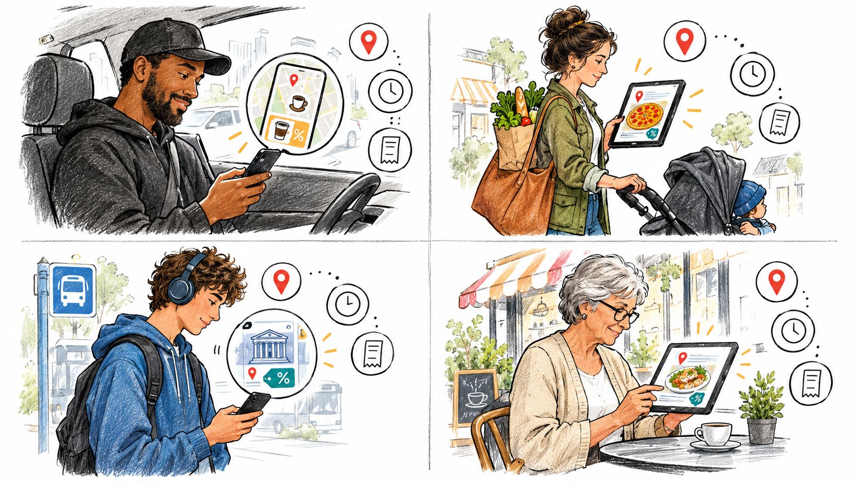
A rideshare driver finishes a drop-off and has a short gap before the next ride. They don't want a giant restaurant directory. They want the cheapest decent coffee or fastest lunch nearby, then a route there and back.
A tourist lands in an unfamiliar city and doesn't want to default to chain spots by the hotel. The map helps them read the neighborhood quickly. A verified local offer can feel like a small local recommendation, not just a discount.
The map works like a local friend who points at the block that actually matters.
A college student uses radius filters around campus to find affordable study cafés, quick dinner options, or late-night stops that are still open. Their main constraint isn't just price. It's distance plus budget plus timing.
A suburban parent plans a Saturday with errands, maybe a family lunch, maybe a quick stop after sports practice. They care about whether a place is easy to reach, open right now, and simple to redeem without extra setup.
<a id="different-motives-same-product-pattern"></a>
Different motives, same product pattern
Those scenes look different on the surface, but the underlying needs repeat:
- Time pressure: the driver wants a fast answer
- Local orientation: the tourist wants confidence in an unfamiliar area
- Budget control: the student wants nearby affordability
- Practical planning: the parent wants low-friction stops that fit the route
A good local deals website serves all four because it's built around place and timing, not only discount size.
<a id="picking-a-local-deals-website-that-saves-time-and-money"></a>
Picking a Local Deals Website That Saves Time and Money
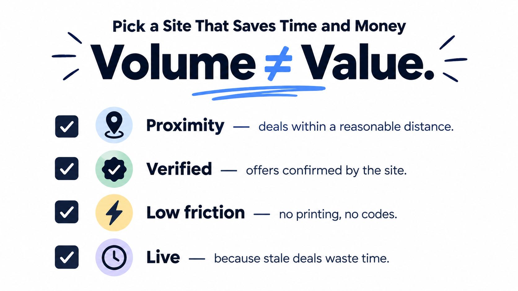
A bigger coupon library doesn't automatically mean better savings. In practice, a smaller set of verified, nearby, low-friction offers often beats a giant pile of vague discounts.
That's even more true now because discovery habits are changing. In 2026, 42.7% of global respondents said they used an AI tool for local search in the past month, 28% tried a new local business because of an AI recommendation, and 53% still verified that recommendation on Google or Bing afterward, according to Yext's consumer local search behavior report. People are open to new discovery tools, but they still check whether the result is real.
<a id="what-to-look-for-first"></a>
What to look for first
A useful local deals website should make quality visible fast.
- Visible distance: You should be able to tell how close an offer is without opening three extra screens.
- Clear status cues: Opening hours, active offer state, and expiry handling should be obvious.
- Verified merchant identity: Real business names and locations reduce the chance of dead-end listings.
- Easy redemption path: If the route to the deal is smoother than the route to a sign-up form, that's a good sign.
A practical tool in this broader category is a deal finder app built around nearby discovery. The useful benchmark is whether the experience starts with proximity and speed, not whether it packs in the largest raw count of offers.
<a id="red-flags-that-waste-your-time"></a>
Red flags that waste your time
Some warning signs show up quickly.
If a site leads with giant savings claims but hides distance, hours, or route info, it's optimizing for clicks, not stops.
Watch for stale codes, vague “up to” language without context, or deal pages that force account creation before you can tell whether the place is even convenient.
<a id="a-quick-decision-checklist"></a>
A quick decision checklist
Use this simple filter before you keep a site on your phone:
-
Does it load like a lightweight app?
Fast launch matters more than decorative onboarding. -
Does the map show offers immediately?
You shouldn't need a perfect keyword search just to start. -
Are hours and location details believable?
That's basic trust infrastructure. -
Can you act without extra friction?
Routing and redemption should be direct.
The best local deals website usually isn't the one with the longest list. It's the one that helps you notice the right nearby offer at the right moment and act on it before the moment passes.
AIR.POG offers a map-first way to discover live nearby promotions, browse them on an interactive map, and route directly to the venue from an installable web app. If you want to see how that model works in practice for local deal discovery, visit AIR.POG.
Spread the word — every share brings more POG'rs to the map. 🎯
Got a story or tip?